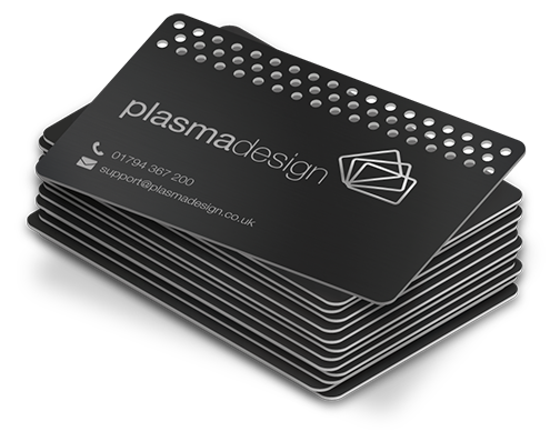
If you’re sending artwork for cards and you’re not working in vector, you’re gambling with the final result. Sometimes you get lucky. A lot of the time you don’t.
Vector files don’t store pictures as grids of pixels. They store instructions: “Draw this curve from point A to point B, fill it with this color, stroke it at this width.” That’s why a crisp logo stays crisp whether it’s printed on a 3.5-inch card or blown up for signage. No fuzzy edges. No weird stair-stepping. No “it looked fine on my screen.”
One-line reality check: Cards are small, and small formats punish sloppy files.
Vectors, explained like you’re not trying to earn a design degree
A vector graphic is made of paths (nodes + curves) and fills/strokes defined mathematically. The output device, your printer’s RIP, a PDF renderer, whatever, calculates the final pixels at the exact resolution needed for that press.
That’s the whole magic. The file doesn’t need to “guess” detail. It describes detail. If you want the slightly deeper production-friendly version, here’s what is a vector file and why it matters.
Raster files do the opposite: they’re already a fixed grid. Scale them up and you’re stretching information that isn’t there. Scale them down and you can get aliasing, mushy type, and thin lines that evaporate.
And yes, there are times when raster is totally fine. Photos belong in raster. Just don’t build your logo, type, linework, foil shapes, emboss plates, etc. as a bitmap and then act surprised when production gets twitchy.
Hot take: a “high‑res PNG” is not print-ready for cards
Look, I’ve seen gorgeous designs get kneecapped because someone exported a 300 dpi PNG and assumed that meant “professional.” DPI helps, but it doesn’t solve the real problem: edges and geometry.
Card printing has a lot of hard boundaries:
– tiny type
– thin strokes
– tight corner radii
– foil edges that reveal every wobble
– emboss/deboss that needs clean closed paths
A raster file can be “high resolution” and still be the wrong tool because it can’t describe those boundaries the way a vector path can.
Where vectors really win: the production stuff nobody posts on Instagram
Most people talk about “scaling,” but that’s the boring part. The real value is predictability.
Die lines, foil, emboss, engraving
Specialty finishes are picky. A foil plate doesn’t want a soft edge. An engraver doesn’t want anti-aliased pixels pretending to be a line. Vector paths give the shop something unambiguous to manufacture.
Strokes stay strokes
A 0.25 pt stroke is a 0.25 pt stroke. A printer can interpret that consistently. A bitmap “stroke” is just a row of pixels that may or may not survive a conversion step.
Color boundaries behave
Vectors keep color edges clean. No haloing. No fuzzy transitions where two colors meet. That matters on coated stock where crispness is basically the whole aesthetic.
A quick stat, since people love numbers
Here’s the thing: you can argue tastes all day, but print workflows are built around standards.
The GWG (Ghent Workgroup) has been publishing PDF specifications and best-practice recommendations for commercial printing for years, and PDF/X standards remain a common target in pro print pipelines because they reduce ambiguity around fonts, color spaces, and transparency handling. Source: Ghent Workgroup, PDF output suite/spec resources (https://www.gwg.org/)
If your shop requests PDF/X-1a or PDF/X-4, they’re not being dramatic. They’re trying to prevent your file from turning into a surprise at the RIP.
Vector vs raster on cards: what actually matters (not the internet checklist)
You don’t need a philosophical debate. You need clean output.
Edge fidelity:
Vectors: razor edges, controlled corners, consistent curves.
Rasters: dependent on resolution, scaling, and how the RIP re-samples.
Type:
Vectors: type stays type, or can be outlined.
Rasters: type becomes pixels, and small sizes can turn into mush fast.
Color:
Vectors: spot colors and CMYK values remain explicit (assuming you set them correctly).
Rasters: embedded profiles and conversions can get messy, especially if someone exports in RGB and hopes for the best.
Transparency and effects:
Vectors can still break if you use complex effects and export poorly. Raster isn’t “safer,” it’s just already flattened, which can be a problem if you flattened the wrong way.
Now, this won’t apply to everyone, but if your card design is heavy on texture and photography, you’ll be mixing raster imagery into a vector layout anyway. That’s normal. The layout file should still be vector-driven.
Formats that actually work in real card printing shops
Not all vector formats are equally welcome at the print counter.
The usual winners
PDF (ideally PDF/X-4, sometimes PDF/X-1a):
Best mix of portability and predictability. PDF/X-4 handles live transparency better; PDF/X-1a is older and forces flattening, which some legacy workflows still like.
AI (Adobe Illustrator):
Great working file. Not always great as a final handoff unless the printer specifically wants it and you know they’re on compatible versions.
EPS:
Still around. Mostly for legacy systems and simple art. It can be fine, but it’s not my first choice unless the shop asks.
SVG, the “yes… but” format
SVG is fantastic for web and some web-to-print workflows, but it’s not universally loved in commercial printing. Font handling, color profiles, and effect support can be inconsistent across tools. If you use SVG, test the printer’s pipeline before committing.
CDR (CorelDRAW)
Common in certain regions and sign shops. Solid editing format. Risky if you’re handing it to a shop that doesn’t live in Corel land.
File prep that prevents 90% of disasters
Some of this is unsexy. It’s also the difference between “approved first proof” and “why is my logo blurry.”
Document setup
– Build at final trim size
– Add bleed (commonly 0.125 in / 3 mm, but follow the printer’s spec)
– Keep live text and important elements inside a safe margin (also printer-dependent)
Color handling
– Design in CMYK when the job is CMYK
– Use spot colors only when you actually intend a spot ink (foil layers, Pantone matches, brand-critical colors)
– Don’t sprinkle “rich black” everywhere without understanding how that prints on small type (in my experience, rich black text is a common regret)
Fonts
Either:
– Embed fonts in the PDF correctly, or
– Convert type to outlines when required/safer (but only after proofreading, outlined text is harder to edit and can bloat files)
Line weights
Hairlines are a trap. They look elegant on-screen and vanish on press. If you’re doing fine rules, ask the printer their minimum recommended stroke weight for that stock and process.
One-line warning: Your screen is not a press proof.
The sneaky vector pitfalls (and how to dodge them)
“It’s vector” doesn’t mean it’s clean
I’ve opened vector files full of stray points, overlapping shapes, and strokes expanded in weird ways that create tiny artifacts. Foil and emboss workflows will expose that instantly.
Fix: simplify paths, clean joins, remove redundant points, and ensure shapes are properly closed.
Transparency roulette
Drop shadows, glows, blend modes, these can render differently depending on RIP and PDF settings.
Fix: export using a print-focused preset (PDF/X when requested), and soft-proof or test-render the PDF in a reliable viewer. If the shop requests flattening, flatten deliberately and inspect the result at high zoom.
Gradients that band
Even in vector, gradients can band, especially if you’re pushing subtle transitions on glossy stock.
Fix: keep gradients within a printable gamut, consider adding controlled noise (not random “texture,” real production-friendly noise), and proof on the intended stock if it’s a brand-critical piece.
RGB sneaking into the file
Design apps love RGB effects, especially when you’re pulling assets from screens.
Fix: preflight your PDF and convert intentionally. Don’t let the RIP be the first thing that decides how your colors translate.
A simple, practical export approach (what I’d do if I’m handing off cards tomorrow)
Look, every shop is different, but this is a reliable baseline:
- Build the layout in Illustrator/InDesign (vector-native).
- Place photos as high-quality raster images (don’t upscale beyond reason).
- Set colors in CMYK and define spot colors only when required.
- Convert fonts to outlines only if the printer prefers it or font licensing makes embedding messy.
- Export as PDF/X-4 with bleed and crop marks only if requested.
- Open the exported PDF and inspect:
– edges at 800, 1600% zoom
– overprint/knockout behavior
– spot color separation names (foil layers should be clearly labeled)
- If there’s foil/emboss: provide a separate 100% spot plate layer per the shop’s spec.
If that sounds like a lot, it’s because card printing looks simple but behaves like precision work.
And honestly? That’s why vector matters. It doesn’t just “scale.” It behaves. Consistently. Across the whole pipeline.

